
From a generic catalog to a gift finder that actually knows who it's shopping for

Giftpals launched on a strong market insight, people don't want to browse a catalog, they want a short, relevant list for a specific person and occasion, but the first version still behaved like a standard online store. I rebuilt discovery around the recipient instead of the product category, turning that insight into something the product actually delivered on.
A catalog that didn't know who the gift was for
Before I joined the team, the platform worked like a standard online store: products organized into generic categories, no different from any e-commerce catalog. That approach missed the actual problem, the user's struggle wasn't a lack of products, it was finding the right gift for a specific person among too many options.
- Users had little structured information about the person they were shopping for, and what information they did have wasn't used to narrow anything down.
- Search, filtering, and sorting ran on generic product categories instead of who the gift was actually for.
- The business model added a second constraint: the interface needed to support affiliate-driven monetization without feeling like an ad-stuffed catalog.
A wizard we tried and dropped, before borrowing mental models people already trust
We tested a wizard first, a step-by-step questionnaire to narrow down the recipient before showing results. Research and interviews against the defined personas showed it would move the needle very little; people didn't want another form to fill out, they wanted the platform to already understand who they were shopping for. The alternative I brought to a brainstorming session, mapping out user pain points and root causes instead of just their answers, is what actually led to the direction we shipped: capture information the way a social platform would, as part of normal use rather than an upfront questionnaire, so the same data both sharpened product recommendations for the user and let someone shopping for them spot a fitting gift without needing a wishlist at all.
Rather than inventing a new interaction pattern from there, I leaned on UX patterns users already understand from social platforms and retail, recognizable filtering, shareable lists, discovery feeds, so the "personalized gift finder" concept didn't need to be explained before it could be used. This also served the business model directly: the platform needed to work like a growth channel for shop owners, not just a search tool, and social-style mechanics turned it into something storeowners could grow their business on without upfront investment, which is part of what made the affiliate model viable for smaller sellers.
I rebuilt search, filtering, and sorting around recipient-based parameters, age, gender, profession, personal interests, and budget, instead of generic product categories, so the first results a user saw were already close to a match. I built the user flows and workflow diagrams for discovery by recipient and by occasion, then presented progress and prototypes directly to the founder and stakeholders to keep design decisions aligned with the business goals driving the roadmap.
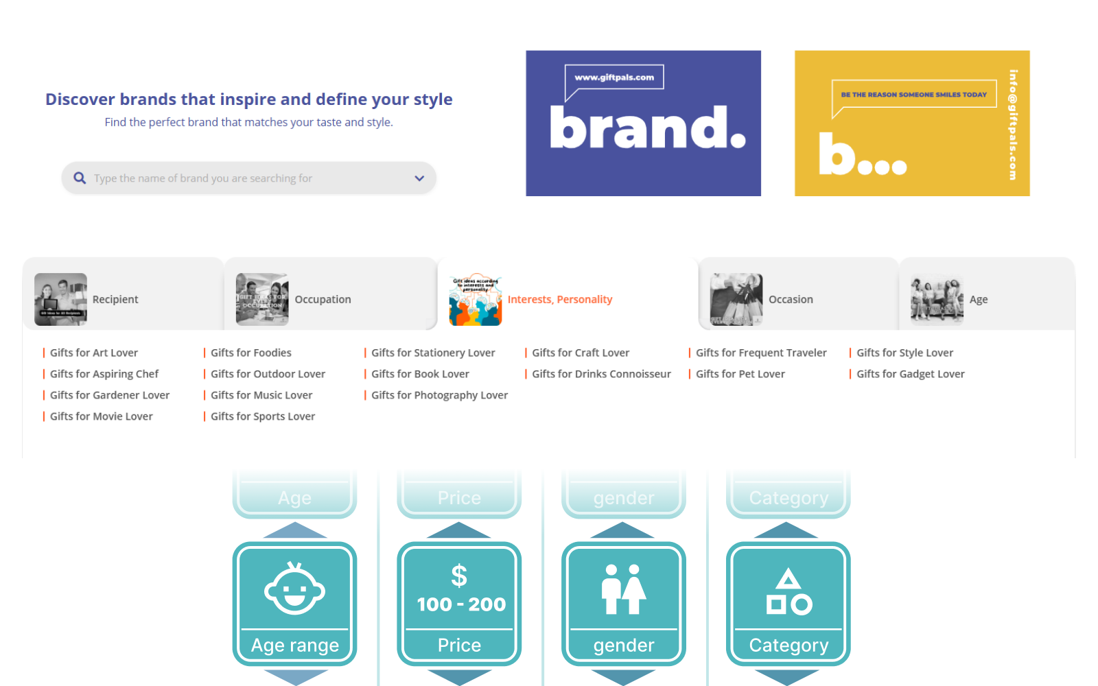 Smart Categorization / Gamified Search
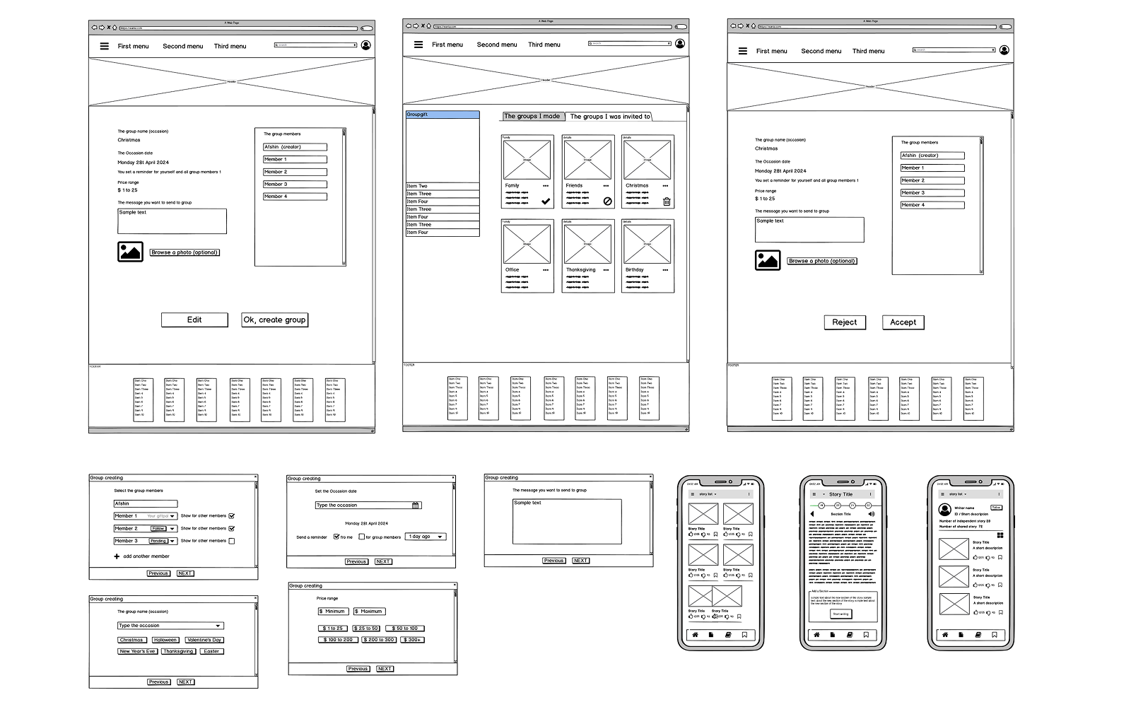 Wireframes / Responsive Versions
Where the trade‑offs actually happened
Rebuilding search and filtering around who the gift was for, rather than what category the product belonged to, was the core fix, it addressed the actual source of user confusion instead of adding more filters on top of the wrong structure. The cost was real for one group: users who already knew exactly what they wanted to buy did better under the old, category-based model. Rather than lose them, I kept that model running alongside the new one for that specific case.
Combining engaging interface design with UX patterns common on social platforms, sharing, following, list-building, encouraged community-driven content and repeat visits, instead of a one-off transactional filter search. The risk I was watching for was that this could tip too far and turn a targeted-search-and-revenue tool into something that just functioned as entertainment, the common failure mode of social products. Keeping every discovery path routed back through the affiliate model, rather than letting engagement become the end in itself, was how I kept that from happening.
I designed a slot-machine-style search mechanic to make browsing for a gift feel more playful, an easy add on top of the recipient-based parameters already in place. The founder liked the direction, but the implementation effort and the timeline at that stage didn't line up, so it stayed a validated concept rather than a shipped feature.
Not every decision was mine to make on UX grounds alone. Fair prioritization of revenue for shops carrying similar products had to follow parameters the founder set from direct market experience, even where I would have approached it differently. Data access and privacy were also kept stricter than a typical social platform, because of regulations specific to this kind of business. Both were cases where the founder's insight and the company's interests came first, and I designed within those limits rather than around them.
Discovery that feels like browsing, not filtering
The final experience lets users discover and share gift ideas in a way that mirrors browsing a social feed more than querying a database, built around a set of features that turned one-off shopping into an ongoing platform:
- A built-in messenger and social layer, where users could share upcoming occasions, interests, and needs so friends could shop for them with actual context, not guesswork.
- Group gifting for occasions like Secret Santa, plus support for corporate gifting for company events.
- An occasion calendar with reminders, so users didn't miss—or duplicate—a gift for the same person.
- Followable brands and shareable gift lists, visible to friends with the user's approval.
- A full dashboard covering store performance, friend lists, income progress, and a user's own saved gift preferences.
- Users could share upcoming occasions and wishlists with friends, so the gifts they got back were ones they actually wanted.
Every result still routes through the affiliate model funding the business.
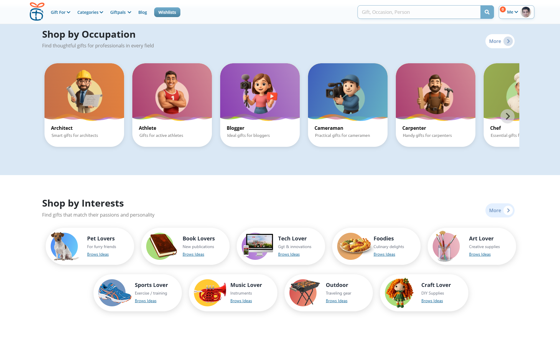 Landing Page / Related Categories
Results after the usability redesign
What I'd revisit
The next real leverage point is AI. A trained assistant could track upcoming occasions across a user's entire circle, compare prices across listed options to surface the best deal for a given budget, and time a notification to arrive with enough lead time to actually act on it, not the day before. Taken further, it could handle the purchase itself: matched to the right person, the right occasion, and the right price, then ordered and shipped without the user doing anything beyond a final approval. And because that purchase would be sourced from the user's own store on the platform, the revenue from an AI-driven sale would still flow back to them, not away from them.